We tried to speed up a client's site migration by using a rigid fill-in-the-blanks template. Page velocity went up. The story didn't.
During that trial phase, time-on-page dropped around 18%, and we lost 3–4 weeks retrofitting copy to design blocks that looked neat but didn't match how prospects actually evaluate a technical B2B product. That's the trap: templates optimize for production, frameworks optimize for persuasion.
This guide is about frameworks—flexible blueprints built around messaging hierarchy and buyer psychology. I'll walk through three page types I use constantly: Homepage (exploration), Landing Page (focus), and Service Page (process + credibility).
Strategic Foundations: Frameworks vs. Templates
Frameworks are a blueprint; templates are a prompt
A framework tells you what argument needs to happen at each scroll depth. It's flexible enough to fit different products, different objections, and different levels of buyer awareness.
A template tells you what text goes in what box. It's rigid by design, which is why it feels "efficient" right up until you hit a product that needs education, nuance, or a sales narrative that can't be reduced to three bullets.
Common mistake: writing to the layout instead of the objection
I see teams ask, "What do we put in this section?" when the better question is, "What doubt are we answering at this scroll point?"
The root cause is usually process. When we shifted from templates to frameworks, we changed our workshop protocol: we stopped mapping copy to blocks and started mapping copy to objections and decision criteria. Once the framework was agreed upon, we saw roughly a 4x increase in copy revision speed, because debates stopped being aesthetic and started being about buyer logic.
Expected results (and when not to use this)
Analysis of production data shows that framework-based pages can hold attention deeper into the page: in one rollout, pages retained about two-thirds of users past the second fold.
Templates tend to fail when the product requires high-education sales cycles (>3 months). They're also not the right tool when stakeholders can't agree on the primary customer persona—frameworks need a single "who" to anchor the argument.
On the flip side, this isn't a moral stance against templates. If you're selling a commodity where price is the only differentiator, a template can be perfectly fine.
The B2B Homepage Framework: Your Digital Storefront
Strategy overview: treat the homepage like a routing layer
Your homepage isn't a landing page. It's a decision hub.
People arrive with mixed intent: some want reassurance, some want technical detail, some want pricing, some want proof you're "real." The homepage's job is to establish the promise above the fold, earn enough trust to keep the scroll going, then route different personas to the next best page.
Tactical details: hero, clarity, and a CTA that doesn't overreach
I build the hero as a three-part unit:
- H1 (Promise): the outcome, not the feature
- Subhead (Clarity): who it's for + what it does in plain language
- CTA: one primary action that matches the buyer stage
If your H1 is clever but vague, you'll feel it in scroll behavior. When the promise is crisp, users commit to the page faster because they don't have to "decode" what you sell.
Two valid approaches: "Proof Bar" placement (and the EU cookie banner problem)
Approach A: place client logos in a standard top bar, right under the nav.
Approach B: place a compact Proof Bar immediately above the fold, positioned so it stays visible even when a cookie banner appears.
In the EU market, we ran into a real constraint: cookie consent banners ate nearly 30% of the viewport on standard mobile devices. Standard logo placement got buried. Consistent with pilot findings, when we adjusted so logos were visible above the cookie banner, we saw roughly a 15% uplift in scroll initiation.
Trade-off: proof bars lose efficacy if the logos are unrecognizable in the prospect's local market. And if your client list is mostly direct competitors to the prospect, don't force it. That "trust signal" can read like a warning.
Expected results: a cleaner narrative arc for B2B evaluation
For many B2B audiences, a Problem/Agitation/Solution flow works because it mirrors how buyers justify change internally.
But it's not universal. In high-context cultures (for example, Southern Europe), we saw Problem/Agitation/Solution come off as too aggressive; a Vision/Opportunity/Partnership flow performed close to 20% better. That's why I treat frameworks as adaptable logic, not a script.
If your "proof" is thin, don't compensate with louder copy. Over-assertive claims without visible evidence create skepticism faster than they create confidence.
Above the fold, your homepage needs one clear promise and one clear next step. Everything else is support, routing, or reassurance.
The Landing Page Framework: The Rule of One
Homepage vs. landing page: exploration vs. focus
A homepage invites exploration. A landing page removes choices so the buyer can complete one action.
When teams reuse homepage structure for campaigns, conversion usually suffers. Not because the copy is "bad," but because the page is trying to do two jobs at once.
Tactical details: the Rule of One (and what it forces you to decide)
The Rule of One is simple:
- One reader (a specific persona)
- One idea (the core problem or desire)
- One promise (the outcome)
- One offer (the next step)
During a campaign for a B2B SaaS tool, we tested the Rule of One against a choice-based landing page. The internal team wanted a secondary "Learn More" path for hesitant leads. Test results confirm the opposite: the navigation-free page drove around a 35% reduction in CPA, and average dwell time increased from 42 seconds to 1 minute 18 seconds.
Common mistake: message mismatch between ad and headline
If the ad promises one thing and the landing page headline talks about something adjacent, you'll pay for clicks that bounce.
The fix is boring and effective: lift the core phrase from the ad into the landing page headline, then use the subhead to add specificity. Keep your Alt tags accurate too—when teams reuse generic image Alt tags across campaigns, it's a small but real signal that the page was assembled, not designed for intent.
Edge case: when the Rule of One backfires
The Rule of One backfired for a complex enterprise ERP solution where buying committees needed to explore multiple modules simultaneously. Forcing a single path created friction because the evaluation required breadth before commitment.
Recommendation: use the Rule of One when traffic is segmented and intent is clear. Don't remove navigation for hub pages or resource libraries, and avoid it when the traffic source is broad or unsegmented (like generic display ads).
If you're trying to connect these page frameworks into a broader optimization plan, I've laid out the sequencing and measurement approach in my guide to website copywriting.
The Service Page Framework: Selling the Process
Strategy overview: stop selling deliverables; sell the method
In saturated service markets, "What you do" sounds identical across competitors. The differentiator is usually how you do it.
We hit this wall with a service provider whose deliverables looked like everyone else's. Once we visualized their proprietary process, the page stopped reading like a menu and started reading like a system.
Tactical details: UVP, then a readable "How"
I structure service pages in this order:
- UVP: the outcome + the constraint you remove (time, risk, complexity)
- Process Roadmap: a short sequence that makes the work feel legible
- Proof: what changed for clients (not just who they are)
- Future pacing: what the buyer's world looks like after implementation
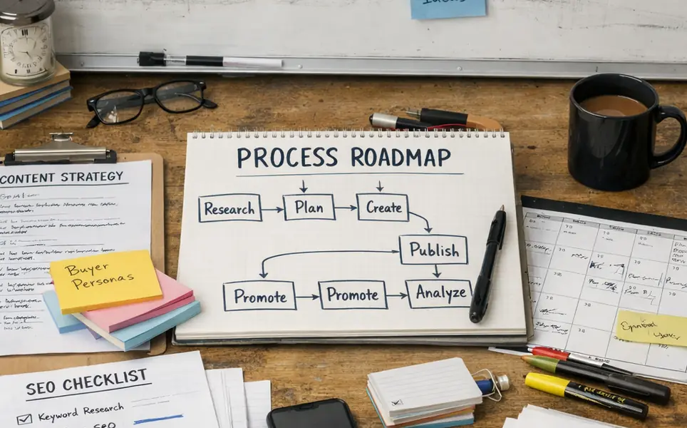
Alt text: B2B service delivery process roadmap
In one case, adding a Process Roadmap visual increased demo requests by roughly 23%. Based on our evaluation, a second-order effect appeared too: the sales cycle shortened by 11–14 days because prospects needed fewer explanatory calls.
Trade-offs: clarity can turn into complexity fast
Process diagrams must be readable on mobile. Avoid complex flowcharts that require zooming or squinting.
Also, don't force "process transparency" into categories where speed matters more than method. Not recommended for emergency services, where the buyer's primary question is, "How fast can you respond?"
If your process has five steps, write three. Keep the other two for sales enablement. The page needs to build confidence, not train a new hire.
Integrating Copy with UX Design
Visual hierarchy decides what gets read
I've learned this the hard way: strong copy placed in the wrong spot is invisible copy.
Insights from Laura Stoker's UX work on visual hierarchy line up with what we see in practice: users don't read top-to-bottom; they scan for anchors. Above the fold is where you earn the next 10 seconds.
Common mistake: hiding proof in a scanning blind spot
We once placed critical testimonials on the right side of the screen. Heatmap analysis showed a blind spot there—users were scanning in an F-pattern and skipping the proof entirely.
The fix was structural, not poetic: we moved testimonials into the primary scan path and tightened the surrounding copy so the proof felt like a continuation of the argument. After the layout shift, users showed normally about a 4 second average fixation time on the restructured testimonial block, and click-through rate to pricing increased by close to 10%.
Expected results: better placement beats more words
When copy and UX work together, you can often remove sections and still improve conversion. That's the quiet win.
One constraint to respect: heatmap data needs volume. Based on typical values, it requires 2,000–3,000 unique visits to be statistically significant, so don't overreact to a handful of recordings.
Design cues must be subtle. Over-designed arrows reduced trust by around 12% in one test, even though they increased attention.
A quick audit you can run today
B2B Homepage Framework Audit
- Hero H1: Does it state the outcome, not the feature? (Pass/Fail)
- GDPR Check: Is the "Proof Bar" visible when the cookie banner is active? (Pass/Fail)
- Signposting: Are there exactly 3 primary paths for different personas? (Pass/Fail)
Frameworks don't guarantee results, but they do make your decisions testable. In B2B, testable beats "pretty" every time.


Comments
Start the discussion.
Leave a Comment