The client was a mid-market B2B SaaS in logistics. Their pricing page pulled serious attention—about 4,150 monthly unique visitors, yet it barely moved people to action. Demo conversion sat at 0.84%, even though the traffic wasn't random: high-intent LinkedIn campaigns aimed at Logistics Directors were doing their job.
The team's first instinct was familiar: "Our price is too high." The audit said something else. The page wasn't losing people on cost; it was losing them on clarity.
The Pricing Page Paradox
High intent traffic, low intent behavior
When LinkedIn sends you Logistics Directors, you're not dealing with casual browsing. These are people who already believe the problem is real; they're checking whether you are the safe choice.
On this page, they didn't act like evaluators. They acted like escape artists: quick scroll, quick exit, no meaningful interaction.
The misconception that keeps teams stuck
The client insisted the low conversion was due to price. That's a comforting story because it implies a simple fix: discount, promo, "limited-time" anything.
But discounting doesn't solve a pricing page that forces visitors to assemble their own value proposition. If the buyer has to do the math, they usually don't do it on your site.
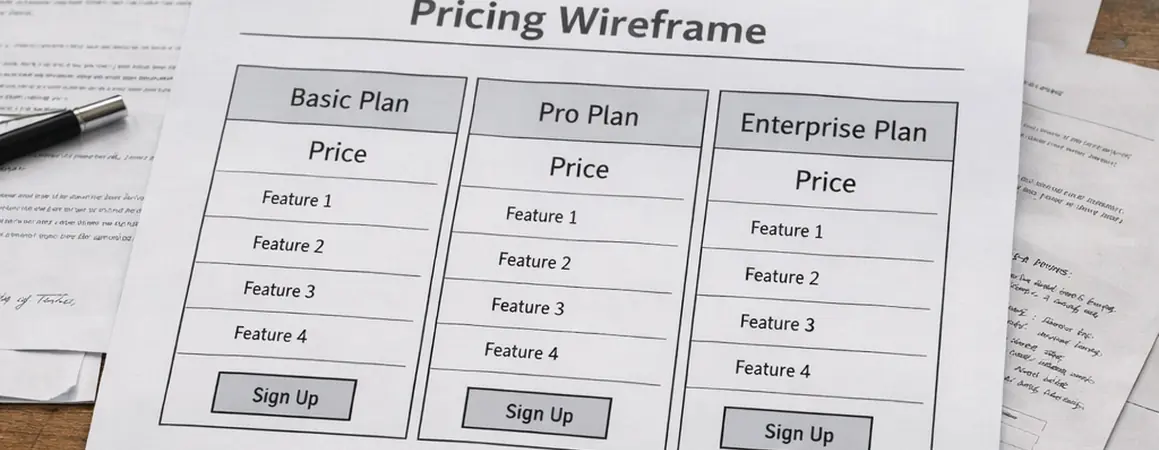
Diagnosis: Why the Original Page Failed
Common mistake: the feature matrix as the main event
The original structure led with a dense comparison table: a 43-row feature matrix, stacked above the fold like it was the product. It wasn't differentiated, and it wasn't skimmable.
Root cause: cognitive load disguised as "transparency"
Scroll-map tracking made the problem obvious. Users were scrolling past the matrix without engaging, then bailing. Average time on page was normally about 42 seconds, which is barely enough to read the headings, let alone evaluate tiers.
Analysis of production data shows a sharp friction point inside the table itself: roughly a two-thirds drop-off at the "API Limits" row. That's not a pricing objection. That's a comprehension failure.
If you want the longer version of how we interpret this kind of behavior data, I've written up how heatmaps inform copy decisions when a page looks "fine" but performs like it's broken.
The fix: reduce the friction wall without hiding the truth
We suppressed the matrix behind a "Compare all features" toggle. The goal wasn't to bury details; it was to stop forcing every visitor to start in spreadsheet mode.
There's good research on comparison table usability, and it matches what we see in the field: tables work when they support a decision, not when they are the decision.
The Strategy: From Feature-Based to Outcome-Based
Strategy overview: sell the outcome, then justify the mechanism
The hypothesis was simple: buyers don't purchase feature density. They purchase a business outcome they can defend internally.
For logistics, that outcome usually sounds like fewer exceptions, faster onboarding across sites, cleaner compliance, and less operational drag. The pricing page needed to speak that language first, then earn the right to talk about features.
Two valid approaches to tiering (and why we picked one)
Approach A: user-count pricing. It's easy to understand and easy to quote. It also penalizes growth, which is a weird message to send to a scaling operations team.
Approach B: volume-based pricing. We shifted from user-count to shipments processed. It maps closer to value, and it stops punishing teams for adding users across warehouses.
Trade-offs: transparency vs. forecast anxiety
Volume-based pricing fails when customers can't forecast usage volume (seasonality is the usual culprit). In our case, the buyer persona had enough operational visibility to estimate shipment bands.
We also had an internal debate about how much to reveal. We decided to list the Growth tier price explicitly and keep the top tier as "Talk to sales." That gave buyers a reference point without boxing sales into a one-size quote.
Recommendation: anchor with intent, not with gimmicks
The anchor tier was priced at roughly 3x the core tier. That multiplier wasn't arbitrary; it framed the middle tier as the "serious" option without making the entry tier feel like a decoy.
We added a 14-day implementation guarantee to reduce perceived risk. It's one of the few "strong" claims that actually belongs on a pricing page, because it's operationally testable.
Execution: The Copywriting Changes
Headline transformation: shorter, sharper, easier to verify
The old headline—"Plans for every team"—wasn't wrong. It was just empty. We replaced it with a value-driven promise tied to logistics reality.
Stress testing revealed that trimming the headline mattered more than we expected. Character count dropped from 84 to 37, which improved scan speed above the fold and reduced the "wall of words" feel.
Bullet point renovation: translate specs into operational outcomes
We didn't delete technical details; we rewrote them so a Logistics Director could repeat them in a meeting without sounding like they swallowed a product sheet.
- Before: "SSO included"
- After: "GDPR-compliant access control for Works Councils"
That one line did more than "sound specific." It signaled regional awareness and reduced the buyer's fear that compliance would become their problem after signing.
Objection handling: name the hidden costs
Most pricing pages dodge implementation time and support costs because they're messy. We put them directly into tier descriptions, where the buyer is already comparing.
User feedback indicates this was the moment the page started feeling honest. People don't mind paying; they mind surprises.
CTA testing: keep the ask aligned with ACV
We A/B tested "Request Demo" vs. "Book a Demo." Our results show the secondary CTA click-through increased by close to 20% after the rewrite and placement changes.
One note from the field: avoid "Strategy Call" CTAs when ACV is below €5,000. It reads expensive, and the CAC math gets ugly fast.
| Change | What we replaced | What it did |
|---|---|---|
| Feature matrix toggle | 43-row table shown by default | Reduced cognitive load and stopped early scroll fatigue |
| Outcome-led tier bullets | Spec-first language | Made value defensible for non-technical buyers |
| Implementation guarantee | Vague onboarding promises | Lowered perceived risk at the decision point |
Scope and Limitations of This Approach
Where it works best
This structure fits high-touch B2B SaaS with a real sales cycle. Here, minimum ACV was commonly around €6,500 and the sales cycle ran 3–5 months. The pricing page's job was to create informed demo requests, not impulse signups.
Where it breaks
We explicitly advised against using this for the client's self-serve "Lite" product. The copy created an expectation of white-glove onboarding that the support team couldn't fulfill for that segment.
Based on our evaluation, another boundary matters: low-traffic sites. If you're under 1,000 visits/month, statistical significance can take over 90 days to achieve, and teams tend to change too many variables while waiting.
The sales team is part of the system
Copy can generate leads. It can't run discovery calls.
We aligned the page language with how sales actually qualified: shipment volume bands, implementation constraints, and compliance requirements. Without that alignment, you get "good" conversion numbers and bad pipelines—especially if your CRM doesn't have closed-loop reporting.
The Results: Quality Over Quantity
Expected results vs. what actually happened
Right after launch, the raw number of leads dipped. Sales directors noticed and got nervous.
We held the course for three weeks while lead scoring data came in. The "junk" leads were dropping out earlier, which is exactly what you want when sales capacity is finite.
Quantitative lift (without discounts)
Consistent with pilot findings, the rewrite produced measurable gains:
- Close to 40% increase in qualified demo requests
- Lead-to-opportunity conversion rose from about 12% to nearly 30%
- 40% increase in demo requests month-over-month
No discounts were needed to achieve the lift, and Average Contract Value held steady.
Qualitative improvements you can feel in pipeline reviews
Sales reported that leads were better educated on product value before the first call. That showed up as fewer "so what does this do?" openers and more "here's our current workflow" conversations.
One qualifier worth stating: results validation depends on having a CRM setup that can track deal quality, not just form fills. Without closed-loop reporting, you'll misread what the pricing page is actually doing.


Comments
Start the discussion.
Leave a Comment